Modular Frontends with Component Driven Design

I work at Sitecore and have recently been working with one of our latest products, Sitecore Experience Manager Cloud (XM Cloud). XM Cloud is Sitecore’s headless content management system (CMS) focused on delivering web experiences managed by both marketers and developers.
With XM Cloud I set out to build a modern site to showcase our upcoming Sitecore user group conferences. As I build out the modern UI I want to avoid creating a complicated and difficult to maintain frontend. Those consuming the content want beautiful interactive designs which often means complex work for me, the frontend developer. What approach am I taking to best maintain a UI with many interacting elements?
That's where Component Driven Design (CDD) comes in. CDD is the practice of building user interfaces with modular components. You want to break your UI’s into the smallest buildable components and piece those components together like Lego bricks. In this post, I will also share my favorite tool for building with CDD in mind, Storybook.
💡 What are Components?
A component is one or more HTML elements with associated JavaScript or TypeScript. A button with a label that prints “Hello World” on the screen could be a component. An individual UI card that displays a profile picture could be a component. With CDD each component should have a single purpose. Again, the Lego brick analogy works well, you will build out little frontend bricks that ultimately are pieced together to create your app.
Implementing with Component Driven in mind?
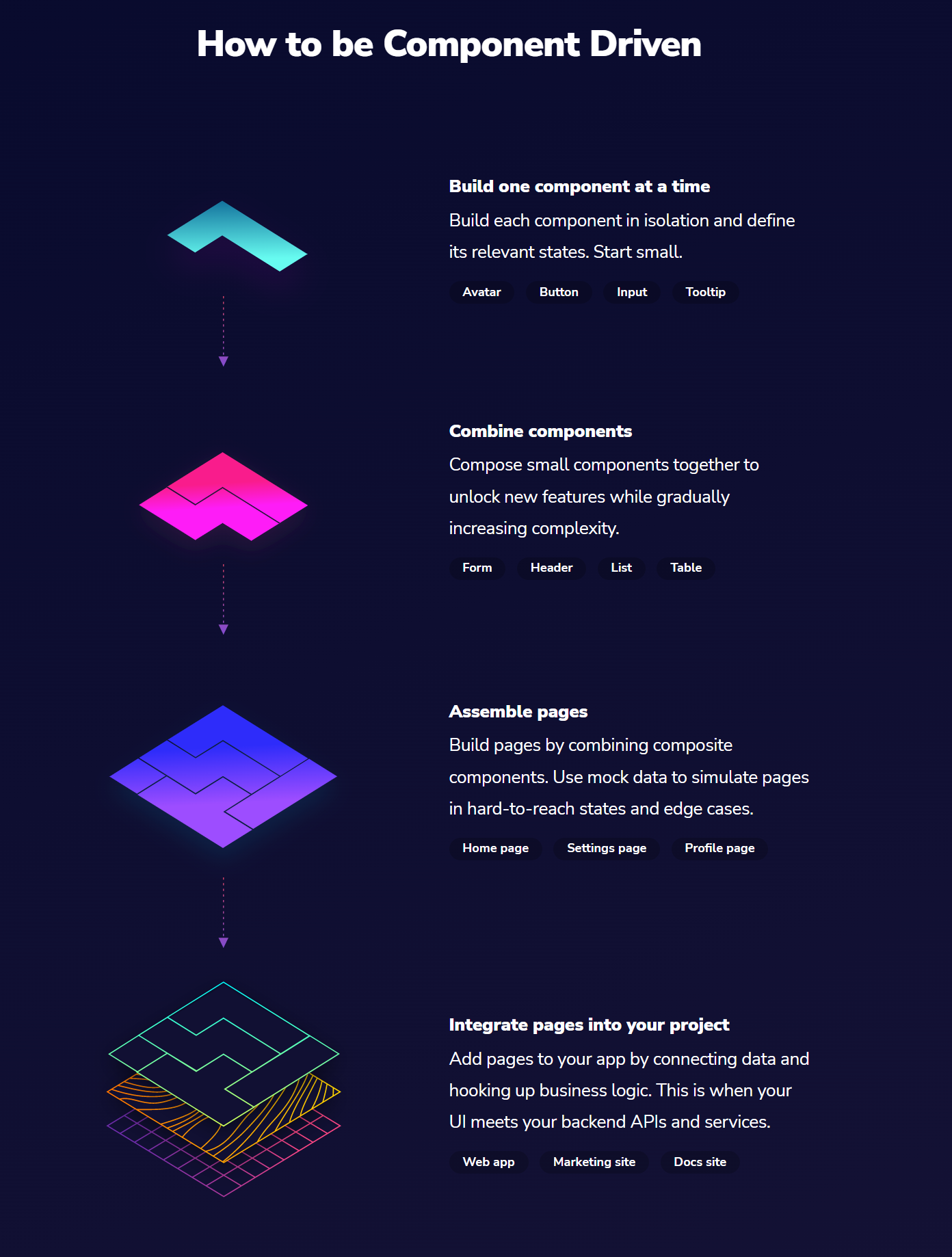
Looking at https://www.componentdriven.org/ “How to be Component Driven” section.

Essentially it all comes down to breaking your UI into the smallest elements possible. Building these small components in isolation. These components are assembled to create your more complex UI’s, and eventually the whole page.
Sitecore Experience Manager (XM) Encourages Component Driven Design
XM Cloud is unique in that it is not only a headless CMS but also includes page building tools for marketers and content authors to use. This encourages developers to work in a component driven way.
Developers ensure that the components they create are as modular as possible so those building the pages have the most flexibility. By having the components broken up into the smallest possible pieces those building the pages have more freedom to build what they want.
Benefits of Component Driven Design
Why would you want to build with this component driven approach? Let’s look at 3 reasons why:
- Focused Work: Developers get to focus on the smallest element. Stop thinking about your UI at a page level. Break it down much smaller. Don’t worry from the beginning about how components will interact with one another. Focus on making your single component work and it will make combining your components later easier.
- Reusability: Because components are developed at a small single-purpose level they can more easily be reused. Components are meant to be modular and with little to no changes be used in multiple places. This can help speed up your development process.
- Distributed Work: A group of developers can more easily separate work. Components are separated from one another so even if the components, in the end, will be on the same page they can be developed in isolation from one another. This allows for more parallel work to be done.
Storybook Tooling

Storybook, a tool that’s fairly new to me but can really help in the CDD process. Storybook is an open-source tool for building components and pages in isolation. It gives you an isolated canvas away from your frontend framework to build and test your UI components.
I’ve found it extremely useful for developing components away from XM Cloud that will eventually be brought into my application. Moving away from the dependencies and complexity of XM Cloud let me focus solely on developing my UI.
It even has testing built in so you can verify that UI’s are built correctly.
Check out the video version of this blog post 📺, to see Storybook in action. There I build a singular component and then piece that together to build more complex components and show the interaction with different data.
Summary
Now you know more about Component Driven Design. It allows you to focus your work on a single element of your UI, allows for better reusability of your components, and can even help you develop faster by allowing more parallel development to happen. Definitely check out Storybook to take your component building to the next level.
Maybe you were already doing it before and now you can be more diligent and purposeful with it. Or if it’s new to you, you can try it out on the next UI you build.